Creating physical flipping cards with CSS
Like many of us, I have thoroughly fallen out of love with the web. At least, the web that we mostly experience today. This stranger's voicing of her frustrations sums up my own disillusionment perfectly:
YOU USED TO BE ABLE TO FIND INFORMATION ON THE INTERNET. i sound insane right now because the internet is a store but it used to be a library
wehpudicabok@kind.social
Enough people have written at length about the problem of "walled gardens", I don't mean to retread that ground here. This is a post about something fun I did with CSS.
Because, despite everything, I still love the technologies the web is built on. CSS most especially. I love that anyone with a web browser and a text editor can make a website (even if actually hosting it somewhere is a little more involved).
Especially in this day and age (I just uninstalled Copilot from my work PC for what feels like the 50th time) it feels almost like an act of rebellion to make something bespoke and whimsical to put on the web.
A few months ago, I put up some poetry I'd made at a blackout poetry workshop on my personal website.
I enjoyed thinking about how to exhibit these as physical objects, which weren't designed for the web and couldn't be modified to better fit its constraints. Images of text, pieces of paper cut into irregular shapes. I decided to show them as images without additional commentary.
I've since made more poetry, which I'll upload too once I have a good quality scan that retains the rough edges of the physical object. I know I want to accompany these new objects with a note, so I've been thinking again about how to exhibit them for the web.
I decided I want to commit to the feeling that these are physical objects. So rather than an explanatory note sitting next to it, I'd like a note scribbled on the back. To see it, you have to physically pick up the card and turn it over. This also constrains the note itself - it has to fit within the boundary of the object.
The CSS
CSS has been able to do 3D transforms for years and years. The rotate3d() CSS function and the perspective and backface-visibility CSS properties have all been widely available for over a decade now.
So, getting a card to rotate is pretty easy. You've probably seen it dozens of times. The challenges to me were:
- How to make the back face really feel like the other side of the same physical object
- How to make the action not just flipping, but picking up and flipping
- How to rough up the smooth edges of the web, to make the action feel more personal and less mechanical
A reverse side that feels real
Here is one of those physical objects, presented as an image:
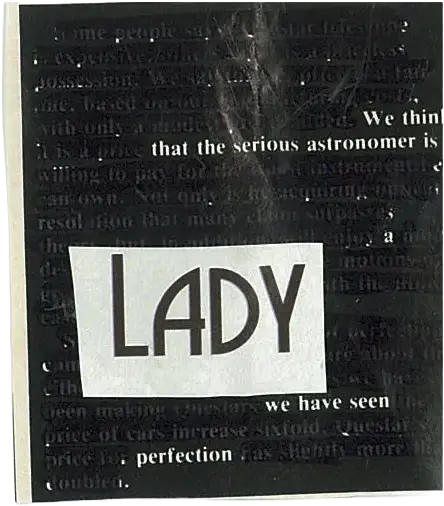
It's a piece of paper, with rough-cut edges and crumple creases. If I were to make the reverse side simply a flat colour, I would lose the feeling of it being a real object. But when you hold paper up in reverse, it's slightly transparent. So, for the reverse side, I reused the same image with some CSS applied to flip it and make it appear like it's being seen through the back of the paper:
			.backface {
	/* Flip horizontally to make it look like the backface */
	transform: scaleX(-1);
	/* Make it look like you're seeing through paper */
	filter: contrast(0.125) brightness(1.75);
}
Picking up and flipping
Flipping, alone, is fairly easy. Try hovering over this card (if you're on a touch device, try tapping it):
			@property --card-rotate {
	syntax: "<angle>";
	inherits: true;
	initial-value: 0deg;
}

.card {
	display: grid;
	place-items: center;
	perspective: 50cm;
	transition: --card-rotate 0.5s ease-in-out;
	/* Rotate around the Y axis */
	--rotate-axis: 0, 1, 0;

	&:hover {
		--card-rotate: 180deg;
	}

	.front,
	.back {
		grid-area: 1 / -1;
		backface-visibility: hidden;
	}
}

.card[data-motion="flip"] {
	.front {
		transform: rotate3d(
			var(--rotate-axis),
			var(--card-rotate)
		);
	}
	.back {
		transform: rotate3d(
			var(--rotate-axis),
			calc(var(--card-rotate) - 180deg)
		);
	}
}
Feels kind of flat, doesn't it? What I really want is for the card to scale up, as thought it's getting picked up during the first half of the rotation, and then scale back down as though it's being put down in the second half of the rotation.
For this sort of value change in CSS, where you start and end at the same value but go somewhere else in between, you'd usually need to use an animation. But I want to use a transition, so if it's interrupted you won't see a jarring jump to the start of the next animation.
Luckily, there's a way to take advantage of having two different faces. If the front face scales up while the back face scales down, so long as they match at the point where they meet in the middle (and swap visibility due to both sides' backfaces being hidden) it should look seamless.
To drive this scale change, I can apply a calculation to the --card-rotate custom property that is already driving the rotation. By dividing var(--card-rotate) by 180deg I can normalise it to a value between 0 and 1. I can then combine it with a configurable --scale-amount custom property to adjust how much scaling applies, and calculate opposing scale amounts for the front and back faces. Here's how it looks:
			.card[data-motion|="flip-scale"] {
	/* Scale while rotating, as though
	   the card is being picked up */
	--scale-amount: 1;
	--scale-offset: calc(
		var(--card-rotate) / 180deg * var(--scale-amount)
	);
	/* Front and back faces scale inverse amounts,
	   swapping at 90deg rotation */
	--scale-front: calc(
		1 + var(--scale-offset)
	);
	--scale-back: calc(
		var(--scale-amount) + 1 - var(--scale-offset)
	);
	.front {
		transform:
			/* Flip horizontally */
			rotate3d(
				var(--rotate-axis),
				var(--card-rotate)
			)
			/* Scale as thought it's being
			   picked up to be flipped */
			scale(max(1, var(--scale-front)))
		;
	}
	.back {
		transform:
			/* Flip horizontally */
			rotate3d(
				var(--rotate-axis),
				calc(var(--card-rotate) - 180deg)
			)
			/* Scale as though it's being
			   picked up to be flipped */
			scale(max(1, var(--scale-back)))
		;
	}
}
Personal, not mechanical
The motion is still very mechanical. Flipping exactly 180 degrees, on exactly the Y axis, and getting put down in exactly the same place. To make the motion more interesting, I apply a few effects:
- Offset the rotation axis so it's not exactly the Y axis
- Avoid using exactly 180 degrees of rotation
Where supported (currently that's in Chromium browsers and Safari, but not Firefox) I make use of the relatively new random() CSS function so the motion isn't the same across every item, or every page load:
			.card[data-motion="flip-scale-rough"] {
	/* Where possible, don't use exactly 180deg
	   for rotation to make it look more dynamic */
	--rotate-offset: 0deg;
	/* Rotate on not quite the Y axis,
	   to make it look more dynamic */
	--rotate-axis: 0.1, 1, 0.1;
	@supports (top: random(0em, 1em)) {
		--rotate-offset: random(-20deg, 20deg);
		--rotate-axis:
			random(-0.2, 0.2),
			1,
			random(-0.2, 0.2);
	}

	&:hover {
		--card-rotate: calc(180deg + var(--rotate-offset));
	}
}